Posts

Featured Post

Metamorphosis: The transformation of a historic architectural icon.

Image
The Cathay Building c.1950s. © NLB Singapore The first skyscraper and mixed used development The Cathay is Singapore’s first skyscraper and precursor of today’s multifunction or mixed-use complex. It opened in 1939 as a cinema, restaurant and dance hall, with a roof garden sited above the cinema. The tower block of apartments opened the following year, making The Cathay the first residential and entertainment complex. During the war years it was a Red Cross station, then the Japanese propaganda broadcasting installation after the fall of Singapore and, following the liberation, the HQ of the British South East Asia Command.  In 1954 the apartment block was converted into The Cathay Hotel, which acquired an international reputation for its cosmopolitan ambience, then repurposed as an office building in 1974. A prestigious office in the heart of the city As the conversion into offices was in progress we at Visual Communications, having served on the advertising front of The Cathay Hotel

How to drive home the message of sweet relief from constipation.

Image
Constipation is a common digestive problem that affects many people in our everyday life. It is characterised by infrequent bowel movements, difficulty passing stools, which is hard and dry. While many factors can contribute to constipation, one of the most significant is a deficiency of dietary fibre. Fibre plays a crucial role in preventing constipation by adding bulk to stools and promoting regular bowel movements. When we eat fibre-rich foods, the fibre absorbs water and swells in the intestines, making stools larger and softer. This makes them easier to pass, reducing the likelihood of constipation. Fibre also helps to nourish gut bacteria, promoting their growth and activity which includes digestion, immune function, and overall health.  For those suffering from constipation Fybogel is the answer.  At the ideation stage of our ad campaign we hit on the idea of a traffic jam as a vivid analogy of congestion in the bowels and to drive home the message that Fybogel provides sweet re

How to future-proof your brand by building the nextgen consumers? Sustagen and Ovaltine show how.

Image
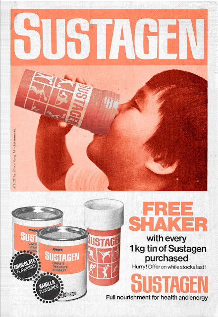
Catch them young and you have them for life. That's how forward looking marketers ensure longevity for their brands. As part of this objective Bristol Myers launched a campaign to educate children on the benefits of good nutrition. To sweeten the deal a beverage shaker was banded with the pack and advertised in the dailies with spot colour ads. With Ovaltine we took a difference approach. We employed the comic strip format to educate the young on how to prepare the beverage hot or cold as they fancy. This ad was produced in conjunction with the  Mr Men’s ’84 Olympics Collection  where consumers collect Mr Men stickers packed in Ovaltine tins and paste them in a collector's album to qualify for a Mr Men School Kit (below) and other prizes. For the World Cup Espana '82 Promotion, Ovaltine offered a Sports Bidon to be redeemed by collecting a set of stickers banded with Ovaltine packs. The premium proved very popular and many school children were seen drinking from their Bidon

Calling all masscom and graphic design students!

Image
Have you ever wondered what was it like to work in a time when there were no digital devices on your desk or lap, or in your pocket? Yes, I'm referring to the days before the Mac and PC, when pen and paper ruled. Artists worked at drawing boards with T-squares and set-squares, creating with pencils, markers, paint and ink on paper, cards and boards. From my Jurassic era days as an advertising creative I have hoarded samples of my work, initially to build a portfolio for career advancement. The collection comprises not only the printed works but also the visuals, aka scamps or initial concepts, hand drawn using traditional media such as pencils, inks, paints and markers, many created well before the computer age. These have become treasured mementos of my days of agony and ecstasy at the drawing board. While the handcrafted designs might appear crude and sketchy when compared with today’s slick renders using stock photos, clip art and proper typesetting, they have an inherent qualit

Designing attractive info-packed Travel Guides to pack seats on Malaysian Airways.

Image
Before Singapore Airlines there was Malayan Airways, then Malaysian Airways. Yes SIA goes back a long time, to 1947 in fact. To provide in-depth information on major travel destinations Malaysian Airways we produced a series of travel guides pitched at both vacationers and business travellers. Contents include details of entry requirements, weather, tips on hotels, dining, sightseeing and entertainment, getting around, i.e. the works. For the covers we designed a colourful composition of tourist favourites in a style contemporary with the times. The inside pages were in to be in black and white, and several pages were marked out for advertisers seeking a medium to reach upmarket consumers. Above: A study concept for the cover of the series. Above: Publications for three destinations were produced and distributed to key travel agents  to kick off the campaign.

How to create an awesome Restaurant Menu: The Kelong Nightclub, Cathay Hotel.

Image
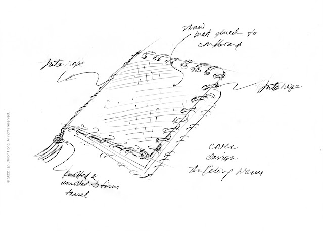
The Kelong was The Cathay Hotel's nightclub inspired by the picturesque fishing traps staked off the island's coast where fish and other sea creatures are directed by a series if palisades driven into the seabed to a holding enclosure under a gigantic platform at the deep end of the structure. Periodically a huge net beneath the waves is drawn up with hand-operated capstans to harvesting the catch of the day.  For the menu design we took the cue from the straw mats and jute ropes used in the operation of the kelong to create something unique with tactile feel and a rustic seaside look. The menu pages would be illustrated with pictures of fish, molluscs and crustaceans, and drawings of fishing paraphernalia such as woven baskets, drying trays, nets and hurricane lamps. Kelongs often hosted night stays for visitors attracted by gourmet dining on live seafood. What could be fresher than the catch swimming right under your feet? A truly delectable delight which The Kelong Nightclub

How we showed Piplay and Display Master ‘123’ as solutions to elegant shelving and furniture accents.

Image
Piplay is a tubular display system for building shelves using metal tubes and connectors in both domestic and commercial settings. Display Master ‘123’ is ideal for creating shelves and cabinets using plastic, glass or wood panels held together with simple metal connectors. To promote these systems we visualised a home setting to showcase their versatility in providing elegant solutions to organise and display home electronics, and build stylish coffee tables and corner accents. The ad visual of Piplay and Display Master ‘123’ in home setting. The final print ad presented the products as display solutions in a contemporary setting. The finished artwork as published in the local daily. 

How do you add pizzazz to container buildings?

Image
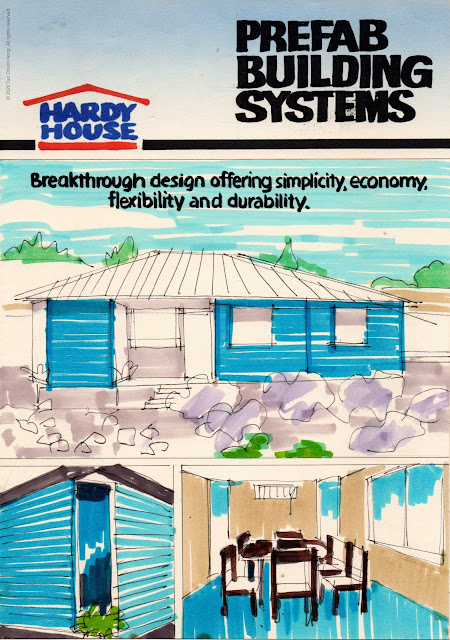
They are everywhere. At worksites, factory yards, school compounds, even on landed properties. Hardy House takes these boring structures and turns them into spacious homes and offices by bridging two or more units with a roof to create additional space out of thin air.  To get this message across we designed a brochure detailing the modular concept of their building system based on prefab panels and structures including complete toilets and kitchen modules. The brochure is richly illustrated with indoor and outdoor photographs and drawings showing various ways to put together attractive offices, homes, chalets, and even complete housing estates. The possibilities are limited only by the imagination.  In most cases the installations are demountable and can be relocated to new sites, minimising wastage and costs. Where needed Hardy House would provide custom solutions with specially engineered pieces to clients’ requirements. Visual for the front cover. Inside spread. Back cover. Below i

How to build traffic to a department store chain with country-themed promotions?

Image
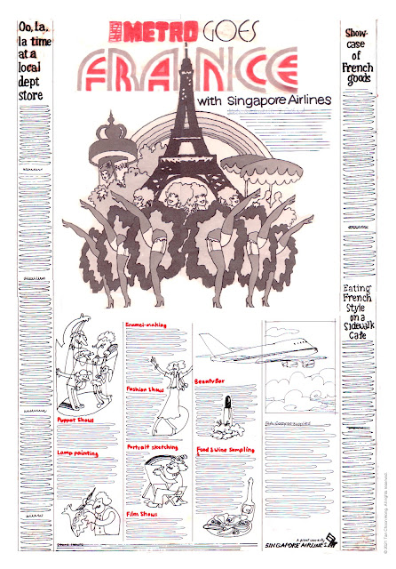
In the 1970s Metro Department Stores embarked on an expansion programme with new store openings, growing from two to five. This growth was built on the back of the economic expansion in Singapore which put money in the pockets of consumers. To drive traffic to there stores a constant stream of promotions had to be produced. We were fortunate to have landed the account as were had just opened shop  It was the era of the "creative hot shop" that swept the advertising world by storm. Small highly mobile designers with new ideas to breathe new life into the industry previously dominated by huge agencies dying on its own deadweight. With a client open to new ideas we crafted several campaigns each focussed on one country's products that brought new excitement to retail shopping. The results were spectacular with tills ringing and profits soaring.  The campaigns began with the presentation of ideas starting with "Metro Goes USA," followed by "France," "

How to lure vacationeers out to sea? We created the Shore Excursion Sales Kit for Cruise East.

Image
This assignment was a rushed job. Briefed in the afternoon, delivery deadline 9.00 am next morning at the hotel poolside. The entire project was rendered for two colour printing in black and green on white stock. Tools used were markers, slab and fine tipped.  Above: The cover  The cover is headlined "Cruise East Shore Excursions" and illustrated with a route map evoking a fun-filled cruise to exotic locations. Above: Contents The inside features a pocket with a diecut of the cruise ship into which are tucked the brochures of the excursion packages. Only six were rendered with their cover designs but left blank inside as examples.  An omnibus brochure containing four bestsellers is also proposed which can also serve as a poster. Above: Front design for omnibus brochure/poster spread over 12 panels, to be folded down to two as front and back covers (the top right ones). Above: Six destinations are featured on the reverse side, each on two panels.      

Piero Olmo Slacks: Spot colour newspaper ad

Image
The visual   The published ad