Posts

Showing posts from April, 2022

How to build traffic to a department store chain with country-themed promotions?
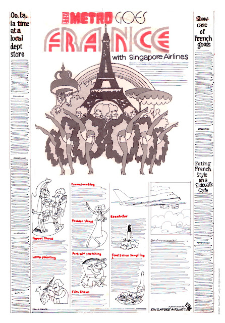
Image
In the 1970s Metro Department Stores embarked on an expansion programme with new store openings, growing from two to five. This growth was built on the back of the economic expansion in Singapore which put money in the pockets of consumers. To drive traffic to there stores a constant stream of promotions had to be produced. We were fortunate to have landed the account as were had just opened shop  It was the era of the "creative hot shop" that swept the advertising world by storm. Small highly mobile designers with new ideas to breathe new life into the industry previously dominated by huge agencies dying on its own deadweight. With a client open to new ideas we crafted several campaigns each focussed on one country's products that brought new excitement to retail shopping. The results were spectacular with tills ringing and profits soaring.  The campaigns began with the presentation of ideas starting with "Metro Goes USA," followed by "France," "

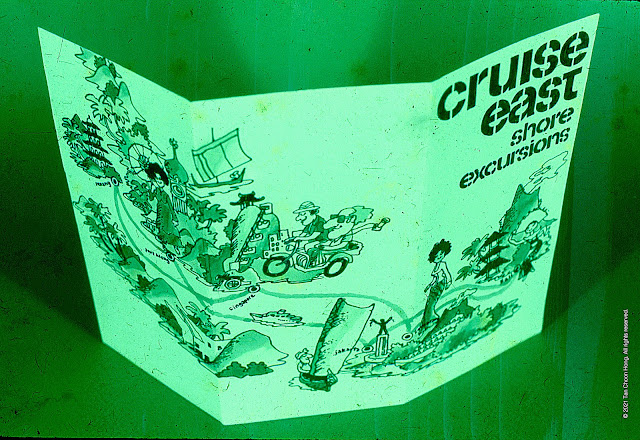
How to lure vacationeers out to sea? We created the Shore Excursion Sales Kit for Cruise East.

Image
This assignment was a rushed job. Briefed in the afternoon, delivery deadline 9.00 am next morning at the hotel poolside. The entire project was rendered for two colour printing in black and green on white stock. Tools used were markers, slab and fine tipped.  Above: The cover  The cover is headlined "Cruise East Shore Excursions" and illustrated with a route map evoking a fun-filled cruise to exotic locations. Above: Contents The inside features a pocket with a diecut of the cruise ship into which are tucked the brochures of the excursion packages. Only six were rendered with their cover designs but left blank inside as examples.  An omnibus brochure containing four bestsellers is also proposed which can also serve as a poster. Above: Front design for omnibus brochure/poster spread over 12 panels, to be folded down to two as front and back covers (the top right ones). Above: Six destinations are featured on the reverse side, each on two panels.      

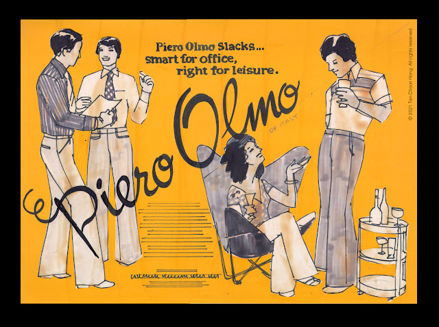
Piero Olmo Slacks: Spot colour newspaper ad

Image
The visual   The published ad

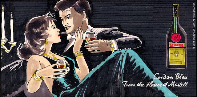
How to soft sell the House of Martell on the back of a bus.

Image
Our aim was not to encourage drivers to drink and drive... who would? We were after the affluent market and they happened to be motorists, who drove or were chauffeured behind buses.  We placed the product in a setting evoking class and sophistication with attractive models in formal attire and a whiff of sexual tension to complete the scene.  From make-belief to reality soft sell always worked wonders in the right hands.

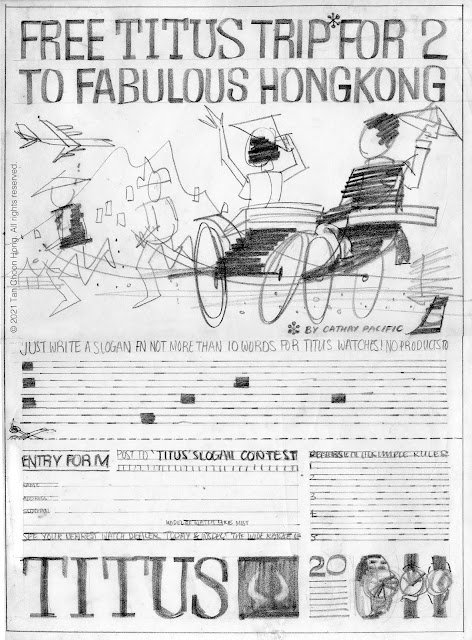
Titus Watch "Win A Trip for Two to Hong Kong" Contest

Image
 This is an example of a hand drawn visual, a vanishing art in the era of digital compositing with the proliferation of online stock photos, clip art and other services. One needs no mastery of drawing to put together a concept that closely approaches the desired outcome for presentation to the client.

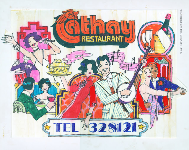
The Cathay Restaurant Cinema Slide

Image
The colourful retro look concept. The visual features a retro style drawing capturing the ambiance of classic old world supper club dining with live band and dancing, sumptuous cuisine, fine wines and impeccable service. The original Cathay Restaurant, also located on the same premises, was famous for its exquisite Chinese cuisine and cosmopolitan clientele which we alluded to with the slogan we created – "The food is Chinese... the mood, international!" The final artwork  

Selling the sizzle of the Kelong Thomson Restaurant.

Image
Concept sketch for venue launch. It was a quick sketch done with markers in black and red for spot colour printing. Restaurant interiors, menu items and topics were roughy indicated for exploration with client. The following were the published material. Above: Website pages.

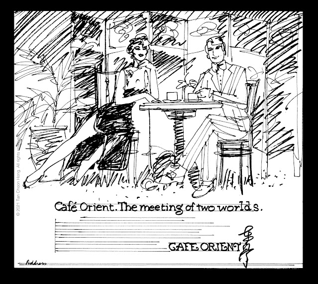
Love at first bite at the meeting of two worlds... Café Orient.

Image
Two worlds meet at Café Orient, offering the pick of eastern and western cuisine served in the finest tradition, surrounded by coromandel screens, porcelain dinnerware and marble-topped furniture. A romantic hideaway in the city centre. Love at first bite. After approving the concept the client wanted the ad to focus on the main attraction – traditional Chinese porridge served in a setting of understated opulence. After some brainstorming we hammered out a new ad headlined "Explore the simple pleasures of Chinese Porridge!"which the client was pleased to accept. With the subhead "Deliciously simple, simply delicious. 7pm-3am" it was followed by descriptive copy "There was a time when people of cultivated taste would meet to savour the simple pleasures of life. Today Café Orient captures that spirit with Chinese Porridge served in a setting reminiscent of a bygone era. Marble-topped coffee tables, fine porcelain and exquisite coromandel screens evoke a sense of

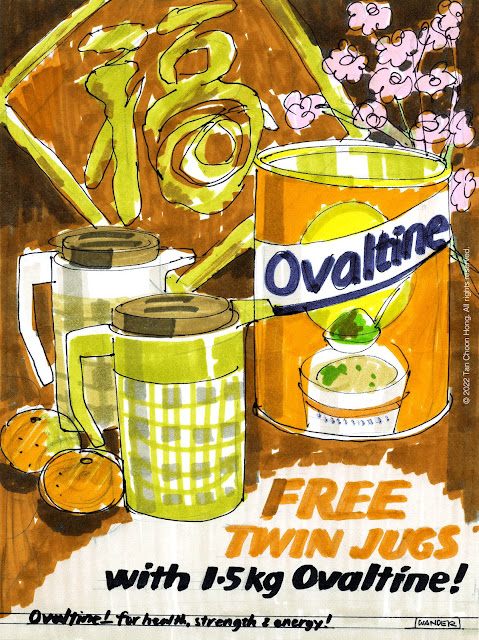
How to buy buyers' loyalty with below-the-line advertising: The Ovaltine Experience.

Image
Outside their branding campaigns Ovaltine often employed below-the-line advertising to take advantage of opportunities to drum up sales such as during festive seasons. These comprise gift-with-purchase or price-off promotions publicised with newspaper ads, comics format print ads, point-of-sale mobiles and tag-on shorts at the end of tv commercials. These promotions drove foot traffic to the stores and sales increases often exceeded projections.   NEWSPAPER ADS & POINT-OF-SALE MOBILES Below are samples of published works for press ads and point-of-sale mobiles. COMICS FORMAT PRINT ADS Nurturing a new generation of new consumers is key to the longevity of brands. Ovaltine used the power of comics as a tool to inculcate the importance of proper nutrition for healthy living. TV COMMERCIAL  TAG-ONS In addition tag-ons featuring the offers are produced for some campaigns to ride on the  wider exposure achieved with brand-building tv spots.